4 Dollar Moves You Need to See…
My wife and I were watching Mad Men the other night on Netflix. One of the characters ends up in a doctor’s office waiting room for reasons that completely slip my mind. But there was a moment where I paused the show and turned to Yulia.
“See that—the magazine she’s holding? I used to read that as a kid every time I went to the dentist!”
If you’re above about 50, you might already know what magazine I’m talking about.
Highlights. (Technically, it’s called Highlights for Children. I had no idea until I just Googled it. And it’s still around! Truly, I’m surprised.)
Highlights was in every dentist’s and pediatrician’s office I visited. And there was one section I always loved: Hidden Pictures, which tasked you with finding a series of, well, hidden objects within a picture.
For whatever reason, my brain is really good at seeing what seems unseeable. I always knocked those out in a minute or so, sometimes less.
I mention this because I’ve been thinking about my professional life as a dot-connector.
See, I was in a taxi recently here in Lisbon, on the way back from, ironically, a doctor’s appointment (no Highlights in the waiting area)… and when the cabby learned I’m a Yank, he suddenly had a lot of questions about the path America is on these days.
His primary interest was whether the US dollar was going up or down, because he’d converted a bunch of euros into dollars a few years ago. (It’s easier to do foreign conversions in Europe than in America within a simple consumer bank account.) The wrongness of that decision was weighing on him. He figures he’s down 12% to 15%.
This, it turns out, is one of the dots I’ve been tracking and connecting for nearly 15 years now.
That period largely saw the dollar rise, with various downdrafts along the way—pretty common for any asset. What I care about though is this chart…

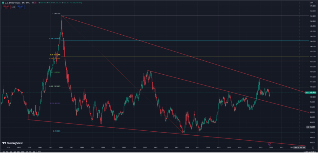
This is the US Dollar Index, which measures the value of the greenback relative to a basket of major global currencies.
I know that’s hard to read. Disregard the numbers, they’re not so important. Instead, I want you to focus on those three red lines. Those are long-term trend lines that start in the late 1970s there on the far left (the bottom line).
Those lines are going in the wrong direction.
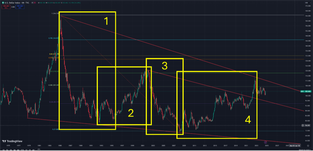
Unlike stock and crypto trends that last for months, maybe a couple of years, currency trends are very often super-long. Here’s the same chart with a slightly different annotation.
I’ll say that to some degree this is comparable to Highlights’ Hidden Pictures—finding what isn’t immediately obvious…

Box 1 marks the dollar’s ultimate peak in 1985, and the ensuing downtrend that lasted until 1995—a decade-long slump.
Box 2, an uptrend that started in 1995, ended seven years later in 2002.
Box 3, a downtrend, lasted six years.
And Box 4 saw the dollar stair-step higher over a 14-year period.
(By the way, there are reasons for all of these uptrends and downtrends, and I’ve spelled them out in the past, so I won’t do it here again. But I will come back to this at some point and go through each of those reasons.)
Now, we’re in the next down cycle—that little unboxed nubbin there at the far right, just outside of Box 4.
This new downtrend marks what I believe are the dollar’s last days as King Currency—the money the world has relied upon for global trade since the end of World War 2.
I won’t go through all the reasons why since I’ve written a lot about those issues over the last two years or so. I will just say that the reasons revolve around too much debt in America, increasing worries globally that the US faces a monetary crisis, and the fact that the BRICS nations are working to release a competing global reserve currency backed by hard assets. Numerous countries have already expressed interest in owning that currency (meaning demand for the dollar, which is already in decline, would slip further).
The ultimate point is that King Dollar now has peaked again. And if you follow those three trend lines you will notice something: Each high is lower, and each low is lower.
In the world of technical trading—in which trades are based on chart patterns—lower highs and lower lows is a bearish indicator.
Short term, meaning for a couple months or even a couple years, the dollar could rally within the longer downward channel. Ultimately, though, the dollar will reach new all-time lows.
My bet: The dollar touches that bottom trend line, somewhere in the mid to low 60s. That implies a decline of 40% from today’s level.
Which means the cost of living in America goes higher over time since a weakening dollar makes imports more expensive. (That will probably be pretty jazzy for the stock market since foreign consumers and companies will spend their stronger currencies buying relatively cheap American products, so that’s the good news for investors.)
But I would want gold in this moment—yet another reason to own the metal.
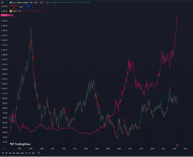
Since about 2001, gold has begun to systematically move opposite of the dollar. You can see that in this final chart…

Gold, the red line, was basically flat from the mid-’80s until 2001, when you can see it largely moving in opposition to the dollar.
Given my belief that the dollar is now in the next, long-term downtrend—I’d say gold has yet another tailwind that will blow its price even higher.
Not signed up to Jeff’s Field Notes?
Sign up for FREE by entering your email in the box below and you’ll get his latest insights and analysis delivered direct to your inbox every day (you can unsubscribe at any time). Plus, when you sign up now, you’ll receive a FREE report and bonus video on how to get a second passport. Simply enter your email below to get started.
